Tuesday, 27 November 2012

Pic 'n' Mix

Haha, so I'm cheating a bit on this and uploading my powerpoint pitch on here ;)

The basic premise is that WW1 soldiers are puppets dancing to the amusement of the generals who are controlling them. The Winter in the Trenches is a pretty backdrop in the puppet show stage, and the soldiers weaving and twirling to dodge gunfire, shells and mines is a jolly game for the generals. If a soldier dies or is injured, it's no big deal to the generals; they just chuck the broken marionette to the floor, and pick up a new toy to replace the one that's been disposed of. Towards the end of what I picture to be a short film, it's revealed that the generals themselves are puppets, and the politician is the one controlling them.


Just a heads up, the dance style I want to have the soldiers doing is Russian Folk dance. I should probably hunt for some suitable music for the animatic. I shall upload some of my research at some point in the near future. In the meantime, I need to get cracking on some dynamic character poses to get the personalities of the characters across. 
Also, I'm not sure which I'd prefer to storyboard/make into my animatic; either the part where a soldier gets shot and then chucked aside onto the pile of broken puppets, or the part where it's revealed that the generals controlling the soldiers are puppets themselves, with the politician being the puppet-master. Hmm, I'm sure I'll figure something out. 

Title Sequence Stuff


Okay, so it's been quite a while since I've posted. And my solution to that is to upload everything in one  massive chunk :D
So up here I've got some more art deco practise/ concept art. I definitely need a lot more practise with pastels and water colours before I can achieve the effect I want with these materials.
And this here is a concept piece for the city scape. As you can see, I was pretty trigger happy with the dissolve tool, and I fudged up my layers with some of the effects, so the light looks like it's shining right through the buildings.
And this was a potential street for the crowd to be walking through. Again, my layers went a bit funny. Must learn to keep track of those.


Here's a bank vault concept

Line art for the bank interior
And the coloured image.


And these are the backgrounds I did to match the animatic. They may need tweaking. I'll just have to wait and see.

TTFN


Tuesday, 6 November 2012

Pic 'n' Mix

Right, here's some more stuff for the pre-production project:


So these are some illustrations in the style of Feodor Rojankovsky; I used water colour pencils, and used the cover of one of the children's books he illustrated as reference.


To tie in with my character being a dancer, I figured I would take a look at Russian folk dance. There's this one in particular called Barynya which seems to tie in with the mood I want t get across (that being a cheerful, jovial atmosphere to contrast the harsh, bloody reality of WW1).

And here's some sketches to get a feel for the movement of the dancers.
Anyways, I'm off now to read up on WW1. TTFN


Thursday, 18 October 2012

Deep Project

Okay, big post coming up now.

In the summer I signed up to participate in the Deep project; this is basically a collaborative film that's a call back to the imperfections of film reels, like the scratches and dirt. The idea is that within every scratch, there is a film - kind of like a portal of sorts. There is a whole mish-mash of different styles, from 30s cartoons to Film Noire to anime.
I've been working on doing concept art for a hallway and store room in the style of 101 Dalmatians (prepare yourself for a flood of photos now).

These were my first attempts. The thing about the style of 101 Dalmatians is that there is a separation of line from the colour; nothing quite fits. For the film backgrounds, the line art and the painting were done separately on different pieces of acetate, and then combined together later on. Also the colours are  more solid, something I definitely needed to work on.
With my second attempt, I used acrylic paint's to try and get a more solid effect. I then scanned it in and drew the line art in on photoshop, again trying to make the lines separate from the colour. I ended up using too wide a range of colours, and was given the advice of using blue and grey mid-tones for the background, only using bright colours for the lightbulb and the planets orbiting it. To create a further sense of depth, it was also recommended that I use a bolder line for the planets and lightbulb, and a fainter line for the objects in the background.
In this attempt, I tried to take on board the advice for getting a sense of depth across. I think to a certain extent I succeeded, so now I needed to work more on the painting technique of the movie.
For my fourth attempt, I wanted to use this shot as a reference for the colours. 
I did the line art on one page, the painting (watercolours and oil pastels) on another page, then scanned them in and combined the two on photoshop. I can't believe I didn't know about using the multiply tool for line art until now, but boy does it help. I quite like the result, although I now it's not remotely like the style I'm trying to capture. The planets and the bulb don't stand out enough, and I think the colours are too bright. Plus my lighting makes no sense at all; I really need to work on that. I'm finding this style quite hard to portray convincingly - hopefully it will come with more practise. It's painting the solid blocks of colour that goes against what I'm used to. 

I also have done some character designs for a 'Who Framed Roger Rabbit' bar scene that takes place at some point. The first one is a flapper cuttlefish, and the second is a biker aye aye. I will redo these at some point, taking into account that I need to have better turnarounds and convey a better sense of the volume of the characters.


Pick 'n' Mix

Right, so we've got the task on our hands to come up with an animation bible in order to pitch an idea for an animated series. And what's a better source of inspiration than pretty coloured cards? I'll let you know when I think of it. 
We had to pick from four different piles of cards, and I ended up with 'Dancer' for my character, 'Winter Wonderland' for my setting, 'Feodor Rojankovsky' for my artist and 'Satire' as my genre.
I want to try getting to grips with the art style first; Feodor is a Russian children's book illustrator, and he seems to use mixed media in his work.


So I've taken a pot shot of the page on the right, using water colours and oil pastels. So far I'm liking it, although I need to be more careful with keeping to his colours. I do think the mixture of wet and dry media creates an interesting texture. Next time maybe I'll use chalk pastels instead of oil pastels, to see what overall effect that creates. I'd also best be practising more with how he draws characters. Anyways, that's all for now. 


Tuesday, 16 October 2012


Some more stuff for the title sequence; I was trying to experiment with the art deco style using chalk pastels. Perhaps next time I will use a medium that is not so messy, as art deco is quite a sharp, precise style consisting of hard edges and symmetry. Oil pastels might be a better option then. I like the bold silhouetted quality of art deco, it's definitely something that would appeal to the eye, especially if it's in motion. 

Wednesday, 10 October 2012


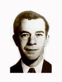
So, 1st project in second year. We have been given the task of making a title sequence, and our group decided to do an opening for a biopic of Willie Sutton. 

He was a thief from the 30s and 40s, notorious for his use of disguises to rob from banks.
When looking into styles of openings, we found the title sequence of 'Catch Me if You Can' to be very visually appealing. The solid, bold colours and the stamp-like style of the characters seems to convey the tone that we are aiming for - the idea of a grand caper and using disguises to evade capture are reflected in the opening, so it ties in well with the life story of Willie Sutton. 
In the pictures above I was trying to get a feel for the style of the character designs, and to try an emulate the grainy texture of the stamps used to make the opening for 'Catch me if you can,' I tried using charcoal.
I'm going to look into Art Deco as a possible style for the backgrounds and setting of the opening, so I'll start looking around at some photos of architecture in that style, as well as paintings. Hopefully I'll have something to post up soon.