In the summer I signed up to participate in the Deep project; this is basically a collaborative film that's a call back to the imperfections of film reels, like the scratches and dirt. The idea is that within every scratch, there is a film - kind of like a portal of sorts. There is a whole mish-mash of different styles, from 30s cartoons to Film Noire to anime.
I've been working on doing concept art for a hallway and store room in the style of 101 Dalmatians (prepare yourself for a flood of photos now).
These were my first attempts. The thing about the style of 101 Dalmatians is that there is a separation of line from the colour; nothing quite fits. For the film backgrounds, the line art and the painting were done separately on different pieces of acetate, and then combined together later on. Also the colours are more solid, something I definitely needed to work on.
With my second attempt, I used acrylic paint's to try and get a more solid effect. I then scanned it in and drew the line art in on photoshop, again trying to make the lines separate from the colour. I ended up using too wide a range of colours, and was given the advice of using blue and grey mid-tones for the background, only using bright colours for the lightbulb and the planets orbiting it. To create a further sense of depth, it was also recommended that I use a bolder line for the planets and lightbulb, and a fainter line for the objects in the background.
In this attempt, I tried to take on board the advice for getting a sense of depth across. I think to a certain extent I succeeded, so now I needed to work more on the painting technique of the movie.
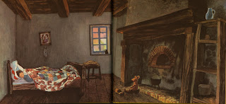
For my fourth attempt, I wanted to use this shot as a reference for the colours.
I did the line art on one page, the painting (watercolours and oil pastels) on another page, then scanned them in and combined the two on photoshop. I can't believe I didn't know about using the multiply tool for line art until now, but boy does it help. I quite like the result, although I now it's not remotely like the style I'm trying to capture. The planets and the bulb don't stand out enough, and I think the colours are too bright. Plus my lighting makes no sense at all; I really need to work on that. I'm finding this style quite hard to portray convincingly - hopefully it will come with more practise. It's painting the solid blocks of colour that goes against what I'm used to.
I also have done some character designs for a 'Who Framed Roger Rabbit' bar scene that takes place at some point. The first one is a flapper cuttlefish, and the second is a biker aye aye. I will redo these at some point, taking into account that I need to have better turnarounds and convey a better sense of the volume of the characters.


