Well, back for third year. It's kind of
surreal how fast things have moved; we've already been back for three weeks out
of an eleven week term. So, let's get updating:
3rd October:
Arriving back, I was planning to pitch myself as a 2D animator so I could help out on someone else's project. However, Kathy suggested that I try my hand at pitching my 'Born with a silver spoon in his mouth' concept. I will run through the origins and development of the idea:
This was an idea that I had come up in a summer workshop,
where the aim was to create a story based upon a randomly selected expression
within an hour.
When I typed 'silver spoon' into Google, I found out that a silver
spoon served the same purpose as a passport/driving license/credit card in the
Middle Ages; a symbol of status so a person would not be confused with a
serf/peasant (an unpaid labourer who worked on the lands of
noblemen). The story that eventually arose was as follows:
In Medieval England, The son of a Lord is mute, due to having a silver spoon in place of a tongue. It is a symbol of his high position in society, but it is also a weakness, as he is incapable of verbal communication. He overhears some peasants plotting to overthrow his father, the Lord of the Manor, but he has no way to warn his father of the danger.
Death lurks in the wings, and we learn that he is the only
one who can communicate with the boy. The Lord's son strikes a deal with the
Grim Reaper to save his father, and Death agrees; he grants the boy the ability
to detect ill intent and poison with his silver-spoon tongue (based on the
property that silver tarnishes upon contact with arsenic). Death then says he
will return to collect something in exchange when he deems it to be the right
time.
The Lord's son uses his newly granted ability to test all of his
father's food/drink for poison, and thwarts several attempts on his father's
life in the process. Enraged by their lack of success, the conspiring peasants
take the direct approach and gather to storm the manor.
The boy hides away and begs Death for help, but Death does not
answer. After a time, the boy emerges from his hiding place only to find Death
standing over the broken body of his father. The boy furiously questions why
Death did not spare his father; Death claims that he spared the Lord from one
manner of dying, but that no one can escape forever. He now wishes to claim his
prize, and expresses his intent to pluck the silver spoon and fashion it into a
scythe.
A frantic chase ensues, and just as Death is about to claim his
prize, the boy literally devours Death and dons the Reaper’s mantle. Suddenly,
the boy undergoes a gruesome transformation into the new Grim Reaper.
To avenge his father’s murder at the hands of the rebellious
peasants, the new child Death unleashes the Bubonic Plague and decimates the
serf population.
After presenting this idea after the hour was up, the feedback was
that for an animation idea that would most likely be a few minutes long, it was
a rather convoluted story. I attempted to streamline the story, with this being
the result:
·
Peasants
want to poison Lord
·
His
son with a silver-spoon tongue overhears and tries to warn him.
·
Father
dies.
·
Son
is distraught, and sees Death about to claim his father.
·
Boy
begs death for vengeance.
·
Death
agrees, but will claim price later.
·
Boy
walks amongst a field of dead and dying peasants, struck down by the Bubonic
Plague.
·
Death
materialises and beckons boy over.
·
Boy
hesitantly approaches.
·
Death
gestures to the boy’s silver spoon tongue, and reaches to grab it.
·
Boy
tries to flee, but Death grabs him by the throat and hoists him up.
·
Death
tears spoon from the boy’s mouth and spoon becomes scythe.
This seemed more simple and feasible to potentially develop into a
short film. Kathy recommended using the Medieval Book of Hours as a potential
influence for style. Books of Hours are the most abundantly surviving medieval
illuminated manuscripts, filled with miniature, opulently detailed paintings.
I wanted to storyboard the idea at this stage, but realised that
the story could be simplified further, as trying to convey a plot to poison the
Lord would require a lengthier potential film. This is the third adjustment
made to the original plot:
·
We
see a happy peasant family.
·
Children
are laughing and playing.
·
Children
embrace parents and profess love. (This would be the only bit of speech in the
film).
·
This
scene is revealed to be a view through a window.
·
The
window is of the Lord’s bedchamber. A young, richly attired boy is at his dying
father’s bedside.
·
The
boy cannot tell his father goodbye.
·
Father
dies and Death comes to claim him.
·
Boy
grabs Death’s cloak, trying to convey that he doesn’t want to lose his father.
·
Death
shakes his head in dismissal and turns to leave.
·
Boy
opens his mouth to cry out, revealing his silver spoon tongue.
·
Death
turns back to look at the boy.
·
Death
reaches down and gestures to the boy to stick his tongue out.
·
Death
inspects the spoon and taps it with a bony finger.
·
Boy
casts eyes to window and gazes upon the happy peasant family.
·
His
eyes mist over, and then his face contorts in jealousy.
·
He
jabs a finger towards the family, tears in his eyes.
·
Death
glances at the family and nods.
·
Death
departs.
·
Time
has elapsed, and the peasant parents are dead from bubonic plague.
·
The
peasant children are weeping over their parent’s bodies, themselves marred by
the Black Death.
·
The
Lord’s son is revealed to be witnessing this from a window in the manor, his
face set in a satisfied smirk.
·
He
feels a chill up his spine; Death has appeared behind him.
·
Death
holds out his hand expectantly, the boy appears confused.
·
Death
taps at the silver spoon, and makes to grasp it.
·
Boy
understands and tries to flee.
·
Death
grabs boy by throat and lifts him into air.
·
Death
rips spoon from mouth; it warps and stretches into a silver scythe.
This was
the point that left the story at in the summer; I did not foresee that this
would become a project idea for third year.
I dwelled on Kathy’s suggestion, and
eventually decided to take up her suggestion. To sure, I wanted to talk in
person to her again. Before I met with her again, I offhandedly ran the idea
past Dan Kris Heap. After hearing it, we decided to band together to work on
preparing the idea for the upcoming pitches. One of Dan’s initial suggestions
from that meeting was to have a parchment texture effect to give the animation
an aged feel. He also came up with the idea to combine the traditional concept
of the Grim Reaper with the bird-like mask of the plague doctor, to put our own
stamp on Death’s appearance.

This seemed particularly fitting due to the
setting of the story being in 14th century England, and this being
the period of when the Black Death spread from Continental Europe to England.
Alex Papanicola offered up his help
with music and sound effects, with Dan envisaging the potential of lyres,
lutes, the harpsichord and the mandolin; essentially, we would like to achieve
an authentic medieval soundtrack.
Lexi Lewis volunteered to try her hand
at some character designs. Dan and I gave her free reign with how to approach
the character designs, although we did suggest that she take inspiration from
the Book of Hours.
When I saw Kathy, her recommendation
was to begin storyboarding the story in order to get a feel for the pacing and how
I could visualise the story. Following this, I refined the story beat sheet by
having the peasant family consist only of a father and son. The motivation
behind this was not only to make the story simpler, but also to highlight the
parallels and differences in the circumstances of the peasant boy/ noble born
boy. Furthermore, from a group discussion we decided to not have the peasant
family be the first characters to be shown, thus reducing their appearances
from three to two. We decided that this was necessary to make the film
potentially shorter.
After this was resolved, I tried
brainstorming some titles for the project and then started doing a very rough
storyboard for the first part of the story.


Dan came up with the title ‘Sliver of
Silver,’ which I liked for the memorable alliteration and the reference to the
silver spoon tongue. He also suggested having Death transform into a crow/raven
to fly away at the very end of the story, as having the last moment consist of
Death holding his new scythe might be lacking finality.
We approached Derek for feedback of how
the story was shaping up. Derek said that the story felt like it was missing an
element; he suggested having the noble born, silver-tongued boy trade the lives
of the peasant family in exchange for returning his father, the lord of the
manor, to life. Derek explained that the motivation the child wanting his
father back makes more sense than requesting the deaths of the peasants purely
out of spite, without even gaining anything from it. It would be akin to the
boy throwing a tantrum. Showing that he wants to save his father makes one more
sympathetic to the child (only slightly though, as he still has ordered the
death of two people).
We agreed that this did make more
sense, and changed the story to accommodate this.
Following this, Dan and I started
working on a script for the practise pitch that was coming up.
7th October:
I began digitally painting the March calendar
painting from Très Riches Heures,
For research into the style of medieval
illustrated manuscripts, I started painting in Photoshop CS6 the March scene
from calendar in Tres Riches Heures.
This is a book of hours that was made between
1412-1416., by the Limbourg brothers. At first, I drew the castle in the scene
on one layer and then painted on a layer underneath the line art. However this
was not producing a satisfactory result, particularly as I lowered the opacity
of the paintbrush to the extent that the final product would have looked rather
insubstantial.

Yasmin Down and Elisabeth Haukaas offered me
some pointers in regards to digital painting; they recommended that I not paint
on a stark white background, but instead have the bottom layer be the colour of
the furthermost background colour in the painting I was trying to emulate the
style of (which was blue in this case). Then they showed me how paint quickly
and roughly the base colours in approximate shapes, and then to build up detail
on top of that.
I found their advice to be very useful,
and my second attempt was shaping to be more successful. I have not really
dabbled with digital painting much prior to this, so the process was allowing
me to begin to learn this technique.

Lexi showed us the various designs of
Death that she had produced. We looked over them and eventually picked the one
that portrayed Death as a tall, yet hunched over figure, with bleached bone
arms that protruded from his cloak and a bird-like mask.
 |
| Death character concepts by Lexi Lewis |
8th October:
I completed the digital painting from
the previous day, and was quite pleased with the result. It took me much longer
than I had anticipated, which was most likely due to it being a learning curve
for me.

Evidently,
I had much more practise needed ahead of me to truly encapsulate the style of
the artists of that era. I would probably try to ask someone more experienced
in digital painting to try their hand at the style.
To prepare for the practise pitch, Dan
made edits to the script that we would use when presenting to the others in our
year, and also experimented with colouring in some of Lexi’s Death concepts.
 |
| Coloured by Dan Kris Heap |
In
the meantime, Lexi did some character concepts of the wealthy father and the
boy with the sliver-spoon tongue.


 |
| Lexi's character concepts |
We pieced the PowerPoint together and ran
through it a few times. After this, I did a rough sketch of what we could have
as a potential title image.

9th October:
The feedback that we received following
the practise pitches was to find a concrete way to emphasise that the boy was
literally born with a silver spoon instead of a tongue of flesh, and to not waffle
on towards the end of the presentation – brevity was key. Derek also
recommended having a ‘wow image’ and a proper environment concept for the
actual pitches.
Lexi, Dan and I discussed how we could
split the work load between us. I offered to design the bedroom that the Lord
of the Manor dies in, hoping that with enough research I would be able to
incorporate the odd perspective and flatness that the artists of that period
employed. I aimed to use references that would hopefully allow me to create a convincing
14th Century solar (sleeping quarters).
Dan would take
on the task of designing the transmutation of the silver spoon into a silver
scythe, while Lexi took on the role of designing the peasant father and son,
and also the ‘wow image.’
Lexi recommended looking up the artwork
of Mary Blair, the person who did concept art for Cinderella, Peter Pan and
Alice in Wonderland.

According to Lexi, her artwork is
blocky, but elegant. I would definitely concur with this opinion.
I did a digital sketch of a castle in
order to find a design that could potentially be used for the manor somewhere down
the line.

In retrospect, I spent far too much time actually trying to look up
what I deemed to be a suitable reference image. I also learned that I took a
while to do a single sketch; I need to commit myself to doing quick practise
sketches as opposed to painstakingly trying to perfect a single drawing.
We decided to meet up at Woodlane
Campus at the weekend, so we could see what stage we were at by then and plan
accordingly.
Alex Papanicola also showed us how the
Newgrounds audio portal and Incompetech could be a useful resource, and said
that he would hunt around for some suitably medieval sounding music.
10th October:
We decided that the simplest way to
show that an audience that our main character had had a silver spoon tongue
from birth, was to have a shot that includes a portrait of the son as a baby,
with his mouth open and the spoon visible.
We also looked up the work of Eyvind
Earle, the concept artist of Sleeping Beauty, to see if any stylistic titbits
could be gleaned from his art.
I at some will watch the ‘making of’
video of Sleeping Beauty, to see how the artists approached adapting the
awkwardly beautiful medieval style into something that could be animated.
We saw the work of the third year
illustrated students today; it would definitely be good to see if any of them
would be interested in doing some concept art for Sliver of Silver, as they demonstrated
an adeptness in translating various visual styles into something that can be
incorporated into a film.
Unfortunately, my laptop began
lagging quite badly today, so after researching furniture and beds of the late medieval
times, I only had two rough sketches of beds to show for the day.

If this were
to happen again, I would try doing concept work in my sketchbook.
11th October:
Jake Teale lent me a book of medieval
styled illustrations by Pauline Baynes, which would be a useful reference for
how humans and animals were portrayed at that time.
When researching her, I discovered
that she had done illustrations for C.S. Lewis and J.R.R. Tolkien. She had also
painted a series of prints that rather faithfully portrayed the efforts of
medieval painters.
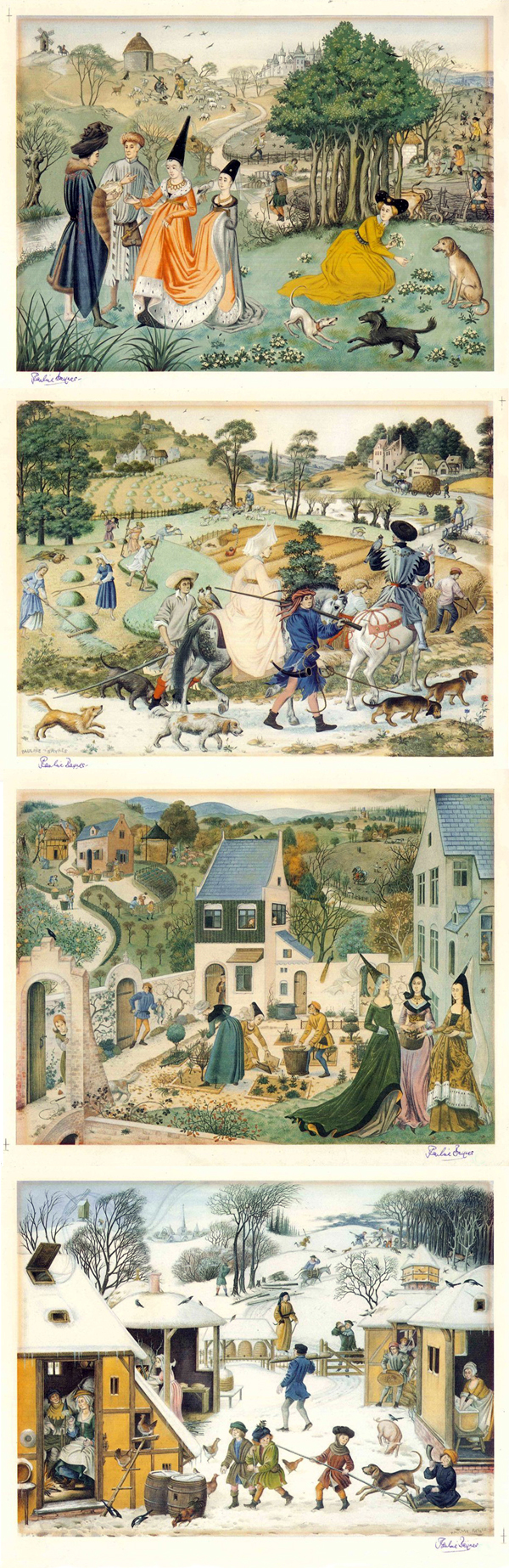
I figured that she might be a good reference for the style
in the near future.
I then undertook research for
designed the manor bedroom, wanting something simple yet something that
demonstrated the wealth of the occupants, all while trying to reproduce the
artists of the past, with their lack of awareness of vanishing points and
linear perspective. Yet again I spent more time than necessary looking up
reference images, and only produced the beginnings of line art for the
environment. I kept on correcting what I had drawn, hoping to achieve the
desired effect. However, it just ended up looking awkward. I am definitely
struggling to understand the workings of this particular style.


12th to 19th
October:
We met up at the weekend in
Woodlane campus library to put together the pdf that we would need to submit on
Monday 14th. I explained to the others how I was struggling to
interpret the desired style, and then proceeded to take out enough books on
Medieval Art to cause my spine to protest. Dan and Lexi advised that I not
think too much about the final result, and to just go with the flow. After we
compiled what we could, I used the books to begin to design a title page for
Sliver of Silver in the style of the intricate letters that could be found in
illuminated manuscripts. I did this in my sketchbook, as my computer
essentially ground to a halt that weekend and I ended up having to clear
everything off of it and reinstall the software.
I tried taking Lexi and Dan’s
advice and ended up producing a watercolour/ watercolour pencil design for the
bedroom. Despite trying to keep to the medieval style, I could not achieve the
flatness, and ended up with something that still displayed conventional
perspective.

After we submitted
the pitch pdf, I digitally coloured the letters for ‘Silver of Silver’ that I
had designed. I would have like to paint them by hand, but for a neater look I
opted to fill it out solidly in Photoshop.

Pitching the idea
was nerve wracking, but a good experience overall. It was enjoyable to see the
range and variety of ideas that others had come up with. The judges emphasised
how important it was to find a way to adapt our chosen style into something
that would allow us to effectively tell the story. The background that I had
done did not portray this well. We would endeavour to find someone with a
better eye for adapting styles, such as an illustrator, to resolve this issue.
On Friday 18th
Oct we found out that Sliver of Silver was one of the ideas that had been
chosen. Now we would have three weeks to produce a script, storyboard and
animatic.
I spoke to Derek in
order to go over the judge’s feedback and ask for advice on how to proceed. He
recommended to begin by copying the backgrounds/characters that the medieval
artists painted/drew to gain an understanding of how they physically drew them
out. I explained how I did not think we would even be able to begin
storyboarding until we had a grasp of the style, as with such a flat style
lacking conventional perspective and with objects out of scale, we would be
able to use conventional camera angles. Derek described a scene transition that
we could do to take advantage of the style; it would probably be a good
starting point for an animation test.
Celaction was
suggested as a potential software, due to the cut-out sort of style that the
characters might have. I will admit that I was somewhat hesitant at that
suggestion, due to the intricacy required in rigging the characters (another
area I lack practise in) but I would bring the possibility up to the others to
see what they thought.
It was stated that seeing how the
creators of The Secret of Kells adapted the Book of Kells into an animated film
(which also has a rather peculiar perspective) would be a good reference.
After the general feedback, I
voiced my hesitance towards directing the project; I felt that I would rather
let someone else take the reins of the project, as I did not feel confident
enough telling others what to do. Derek suggested a compromise of having
someone co-direct, so that we could split the responsibility down the middle.
Dan and I met up on the weekend to
discuss the feedback. It was decided that he would take on the role of producer.
We started discussing target dates for when we want to have script, storyboards
and the animatic done by. I asked for Dan’s advice in regards to what I should
do about the director role, and he agreed with Derek’s advice about finding a
co-director. I also asked Dan what he thought about the possibility of the boy
still being alive after having his tongue ripped out. We concluded that we would
prefer if he died, as it seemed to have more of an impact and sense of
finality, but we would check to see what Lexi thought.
21st Oct:
We looked through the list of
illustrators that our class had met before, until we found one whose artwork
potentially reflected the flat style we want to achieve. I sent them an email
quickly summarising the story idea, plus some of the concept work our group had
already done and a mood board. We also asked Freddie Horton if he would take a
crack at designing the medieval bedroom, showing him the books I had taken out
about the illuminated manuscript style. Freddie showed me how to use the google
drive to store and share files with others, as a method to send him some
reference pictures that I had gathered from my unsuccessful attempt to design
the bedroom. This seems to be a great way to back up work and allow for easy
access to files, so I would definitely like to adopt this technique.
Dan started digitally painting concept
art using one of my library books as reference, and I started sketching out one
by hand. I want to emulate the style the best that I can, but not get too
bogged down with details After all this is merely a way to gain an understanding
of the artist’s method, not the final product.
I asked Lexi if she would act as
the co-director, and she agreed to the role. This felt very reassuring, as the
burden is now not entirely resting on my shoulders. As they say, two heads are
better than one.
My apologies for that monster of a post.
I’ve gone cross eyed from writing it, so I hope I haven’t caused anyone permanent
damage from reading it.