2nd Sliver of Silver update:
Oct 22nd – Nov 7th
The team’s goal for the remainder of the week was to try to
get to grips with the style of the medieval manuscripts, and also to have a
first draft of a script ready for adaptation into a storyboard. I said that I
would like to have a go with putting together a script, as I feel quite
confident with writing. After that, I would hand it over to the others on the
team and adjust it according to their feedback.
I spent far too long actually looking up sample scripts and
online guides for writing scripts specifically for animation. I suppose that my
mind-set at the time was that before I could even begin, I needed to have a
full understanding of the typical structure of a script. Furthermore I realised
that my awareness of camera moves and the different terminology for them was
rusty, so I again tried to look them up and verse myself this knowledge before
I would actually start writing.
After thinking that I was ready to get writing, it occurred
to me that as there was no dialogue in the story, the structure that I had
originally assumed I would follow no longer seemed to fit. I did not know how I
could write a script and refer to the characters without any speech. Eventually, after searching for examples of
scripts with no dialogue and not yielding anything, I approached Andy for
advice. He gave me some useful pointers such as treating the script as more of
a beat sheet, essentially listing the actions that the characters carry out.
However, by the time I asked Andy for advice it was late in
the evening, and so it was a rather unproductive day.
When I actually sat down to write the script without
worrying so much about the outcome and making mistakes, it flowed much more
easily. I would definitely be more efficient if I applied this mind set more
often.
As we were somewhat baffled by the medieval style, we had asked
Freddie Horton if he might be able to have a go at producing some concept art
of the bedroom in which most of the action takes place. Here is his first
digital piece:
(source: http://atelier-st-andre.net/en/pages/aesthetics/byzantine_perspective.html)
Freddie said that he would do it
traditionally as opposed to digitally, and this is what he came up with:


These seemed promising, showing the ways that perspective
can be manipulated to create an atypical effect – something beyond one’s normal
perception.
Along with research, we wanted everyone in the team to have
a go at doing really rough, quick thumbnail interpretations of the script. Dan
Heap and I figured that this would be a good approach to generating a lot of
ideas quickly, and being able to get immediate feedback on these ideas would
further speed up the approach.
Of course, these things are easier said
than done. When we got stuck in the process we realised that that we had not
come up with a consistent layout of the room as reference. We quickly
brainstormed one and Dan drew up a rough version of the layout of the room.
Some other ideas were generated at the start of the storyboard/layout design process. When drawing, Freddie came up with the idea to have the silver-spoon boy be stood/kneeling by his father’s bed instead of being sat in a chair. This served to simplify potential animation later on down the line. It meant that when confronting Death, the boy would already have the window at his back, making staging the action more sensible.
Some other ideas were generated at the start of the storyboard/layout design process. When drawing, Freddie came up with the idea to have the silver-spoon boy be stood/kneeling by his father’s bed instead of being sat in a chair. This served to simplify potential animation later on down the line. It meant that when confronting Death, the boy would already have the window at his back, making staging the action more sensible.
Dan came up with an interesting camera transition while
drawing; he suggested that when we went to a close up of the portrait baby with
a spoon in its mouth (to show that the boy was born with the silver spoon), we
could zoom in even closer to the mouth, and then have that same shot be the
mouth of the boy at his current age. Then we would see Death’s hand come in and
touch the spoon, bringing us straight from the portrait revelation to the
action.
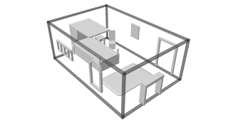
After this, Freddie offered to model a 3D version of the
room so we would have a clearer idea of the layout, plus be able to plan out
character movements and camera orientation with further ease:
Dan volunteered to experiment in Adobe Illustrator to see if he could achieve a flat look for potentially animating characters with:
I rather like the look of this style, especially the lack of an outline and the way that the folds of the cloak have been done. If potential backgrounds have a more textured, organic feel to them, then it would allow the character to stand out more.
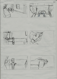
Lexi Lewis and I carried on doing the rough thumbnail
storyboards while the others were working on these tasks. Here are mine:
I started storyboarding from the point when Death first appears. It seems that even when trying to draw as roughly and fast as I can, this took me longer than I anticipated.
Here are Lexi’s thumbnail storyboards (she covered the
entire script):
After showing these to the others, Lexi and I went through the boards and went through some of the changes that we wanted to make when it came to doing the final ones in 16:9 ratio. In retrospect, based on feedback from course tutors, it would have made the process smoother if we had done even our thumbnail boards in a 16:9 ratio.
After showing these to the others, Lexi and I went through the boards and went through some of the changes that we wanted to make when it came to doing the final ones in 16:9 ratio. In retrospect, based on feedback from course tutors, it would have made the process smoother if we had done even our thumbnail boards in a 16:9 ratio.
At the weeklies, the feedback was to carry on with research
into the medieval style. I had tried previously exploring this:

I was enjoying the process of doing this, but the results yielded were definitely not what I would visualise the film resembling.

I was enjoying the process of doing this, but the results yielded were definitely not what I would visualise the film resembling.
I am a slower drawer,
and I am not an experienced painter. Hopefully more practise would improve the
pace at which I work.
Previously, Dan and I had chosen a third illustrator to help
come up with some concepts of the medieval style with its elusive perspective
that we couldn’t quite nail down. I had gotten in contact with Vivien Martineau
based upon her illustrations of the Indian epic poem Ramayana. Here is a link
to her blog: http://www.behance.net/vmartineau
What particularly appealed to us about her style was the
solid flatness that these particular paintings exhibited, plus the repeated
patterns that she used. It seemed to be heading in the direction that our team
was trying to achieve. To my delight she responded to the email that I had sent
her, and we made arrangements to meet up.
I explained to her that we were having difficulties getting
that odd near-lack of perspective across. Lexi and I had scanned in loads of
reference images from the book that Derek had lent us. It was a pleasant
surprise to discover that Vivien had worked in a medieval style for a previous
project, so she already had a strong vision of what we wanted.
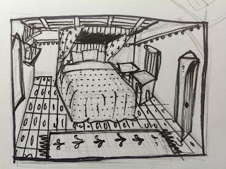
I asked her to come up with a sketch of the bedroom, perhaps with some colour/pattern tests for the bed sheets and curtains. Taking some time out of her busy schedule – she was away at the weekend - here is what she produced:
I asked her to come up with a sketch of the bedroom, perhaps with some colour/pattern tests for the bed sheets and curtains. Taking some time out of her busy schedule – she was away at the weekend - here is what she produced:
I am glad that she painted her concept traditionally; it
makes me think that backgrounds painted would produce results that are more
akin to the miniature paintings found in illuminated manuscripts.
I am pleased with these concepts, and believe they begin to
show the potential to play around with the unique space that medieval artists
used in their paintings. In Vivien’s words ‘a really important thing to make it
look a bit skewed is to make it look as if the floor is sloping down, then once
a character or object is placed over that, upright, it adds to the distorted
perspectives.’
If ‘Sliver of Silver’ does get
picked, then I would like to ask Vivien do some more exploration into these
principles, and perhaps even some final backgrounds further down the line.
After Lexi and I had decided some
changes to the storyboards, we then divided the work in half so we could go
away and draw up the final versions. Dan offered to start making an animatic
based on the rough storyboards, so that he could begin to get a feel for the
timing.
Alex Papanicola had kindly offered to do the sound design
for us. After giving him a list of the required sound effects for the animatic,
he very promptly compiled a whole sound collection with a several options for
each sound effect.
Giving this and the final storyboards to Dan, he began to
stitch together the animatic in Premiere Pro.
Lexi, in the meantime, was finalising the character designs.
She had done more research into the medieval style, and this was the result:
Here is a rough size chart of the characters:
 |
| Peasant son |
 |
| Peasant father |
 |
| Lord Hugh de Seolfor |
 |
| Ralph de Seolfor |
 |
| Death |
Here is a rough size chart of the characters:
And here are some attempts at backgrounds in a 16:9 ratio
that I did:
With a few pointers on holding some of the frames for a little longer from Lexi and me, Dan produced the animatic.
It came out to a shorter time than I expected it to, based upon the script. This was a relief, because I was worried it would be too long.
Now all that is left to do for now
is to wait and see if Sliver of Silver has gotten through. Regardless of what
happens, I am so grateful for everyone’s hard work these past few weeks; I’ve
found working with these people to be a really rewarding experience.
Dan Heap: http://scarfeddan.wordpress.com
Lexi Lewis: http://lexilewisanimation.wordpress.com
Freddie Horton: http://freddiehortonanimation.blogspot.co.uk
Alex Papanicola: http://pappyworld.tumblr.com
Vivien Martinieau: http://www.behance.net/vmartineau


